


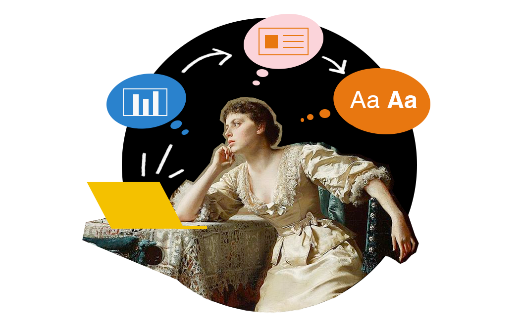
Fictional Art Museum | FicAM
Project
To keep my UX skills sharp, I started the Google UX Design Course. With the course as a guide, I designed an app for a fictional public art museum allowing user feedback and research guide the process.
Role
Visual Designer | User Research | Wireframing | Prototyping | Testing
Secondary Research
Based on the information from this 2021 Medium article, most respondents cited price, not enough information, long lines and not enough museums in their area as barriers to attending museums. They found out about new museums and exhibitions through social media, family and friends, posters and local papers. Respondents were visiting local museums but had varying experiences though they were motivated to engage.*
“Barriers keeping me from going to a museum more often are price, not knowing what’s available, and not having a good overview.”
Weijand, Maddie. June 6, 2021. How UX can support museums in attracting more visitors. Retrieved January 10, 2024, from https://mweijand.medium.com/first-problem-to-tackle-and-its-a-wicked-one-9d4b0efb40cf*
In a study led by the University of Florence has shown that visitors to a modern art museum feel more excited and positive about the artworks they see when they have full information about them. Supported by the EU-funded GenPercept project, the study suggests that descriptive labels lead to better comprehension and a more satisfying aesthetic experience than simple labels providing only basic information about the artwork.**
Cordis UE Research Results. July 18, 2023.How to attract more visitors to modern art museums. Retreived on January 11, 2024 from https://cordis.europa.eu/article/id/445212-how-to-attract-more-visitors-to-modern-art-museums**
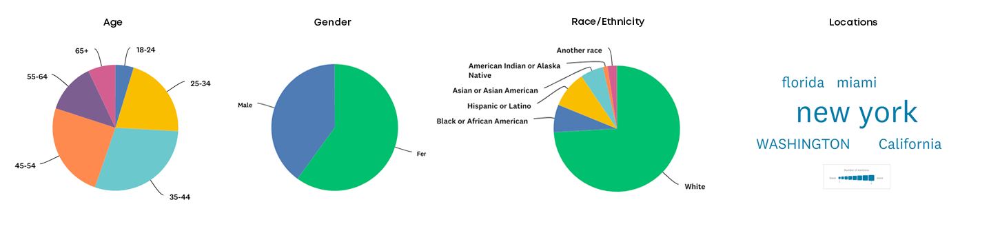
Primary Research
85 Respondents | Survey was conducted with a paid audience through Survey Monkey
My overall goal is to learn how users gather information about a museum, plan a visit and experience art museums, particularly using a museums website. The secondary research gave me a broad view of user's interactions with museums on the whole. So I used the online survey to narrow the focus to users interactions with Art Museum websites.
Findings
I used AI to help analyze the survey responses. I asked it to summarize and give me the top 3 answers for each question asked. These are the main take aways.
Helpful information with planning a visit to the museum:
Information about current and upcoming exhibits*
Online ticket purchasing options
Maps and floor plans of the museum
Common challenges:
Difficulty finding comprehensive information about all available exhibits*
Lack of detailed event information
Navigational challenges on the website
Ratings for online maps and floor plans:
Very effective*
Popular suggestions include:
More detailed information about specific exhibits and events*
Interactive features or virtual tours
Better information on parking, accessibility, and amenities
Summary
The research and survey indicate that users have a better experience with more information, including descriptions on art, information of everything on display and maps.
Persona

Watts Carlson
Age: 35-44
Location: Washington DC
Visits Art Museums every few months
"I want to know everything that's available"
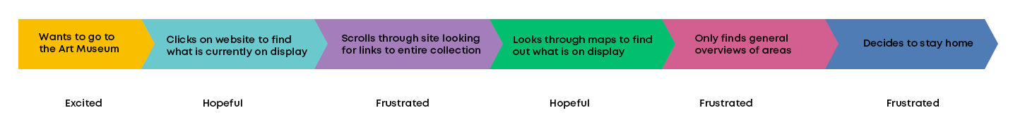
Frustrations
Sites often talk about new exhibits but I want to know everything that’s available.
Would Like
Map by eras or types of art would be helpful
Virtual walk through
Goal Statement
This Art Museum app will allow users access information on all the art available and create personalized maps to specific art. The app is an opportunity to encourage museum attendance.
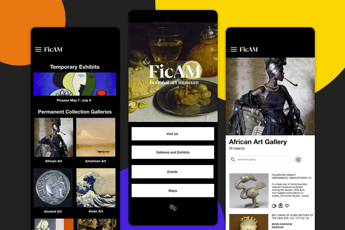
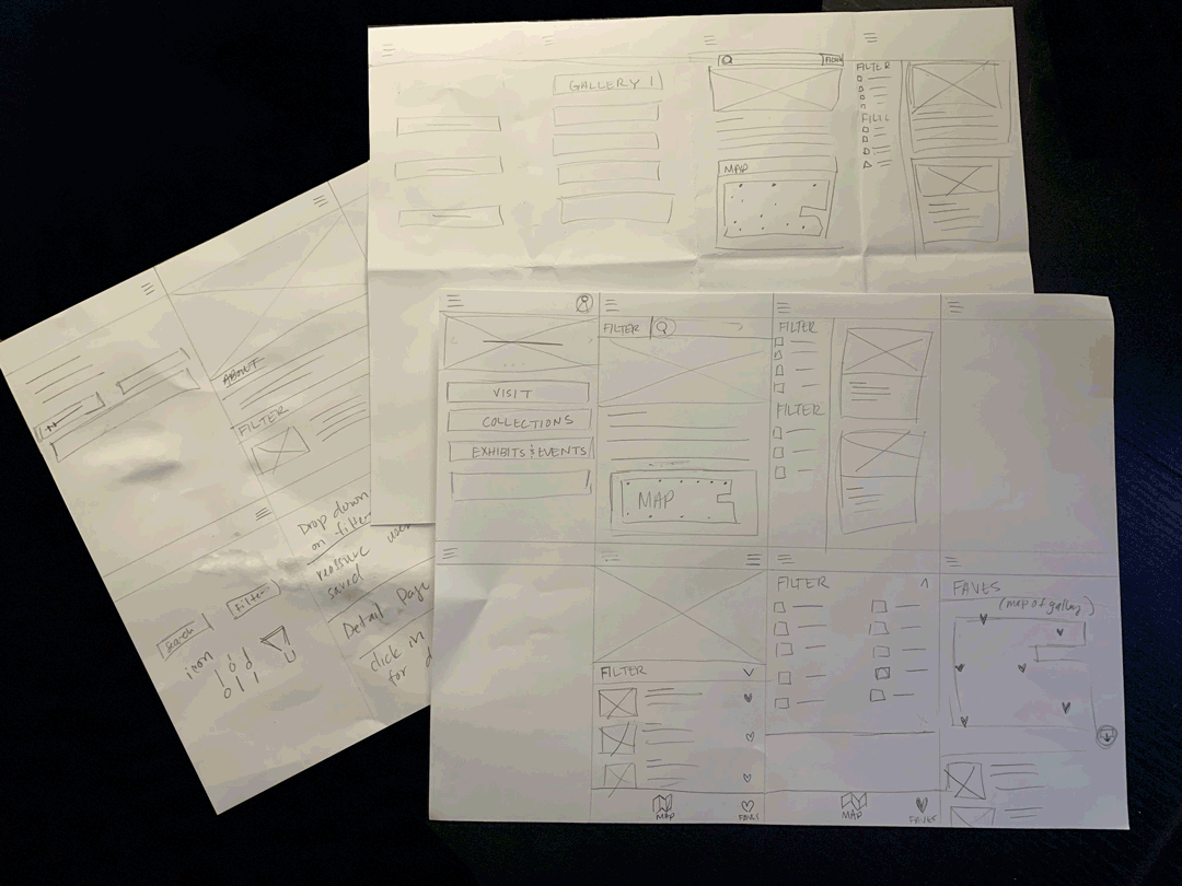
Wireframes
Using my sketches as a guide, I started building mockups and prototypes in Figma.
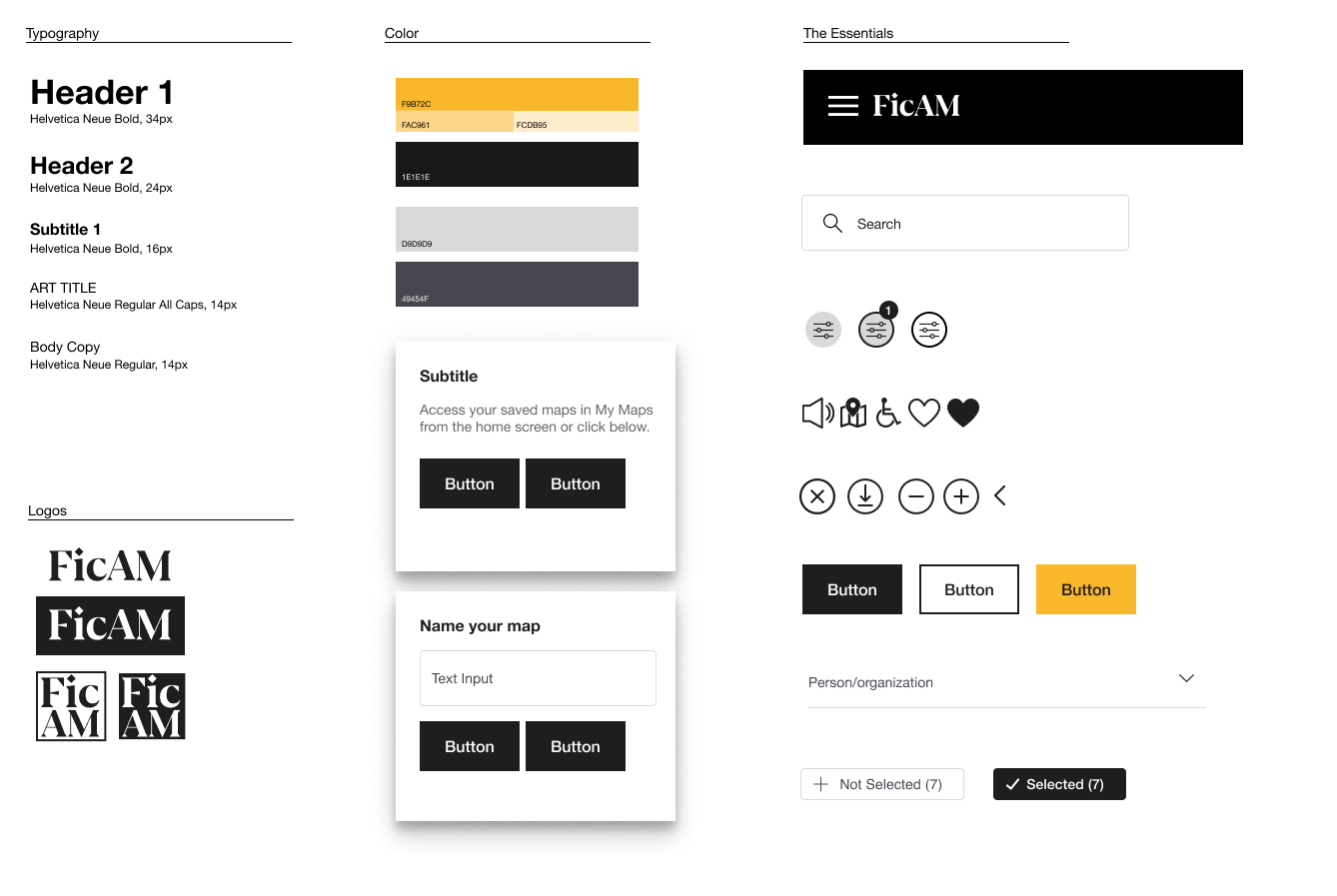
Toolkit
I used components and styles in Figma to create a sticker sheet of often used items to build out the prototypes. These are the final iterations which are present in Prototype 3. Prototypes 1 and 2 show early iterations.
Prototype 1
After testing the wireframe with participants, this iteration of the prototype was developed using Figma. Users were asked to find the African Art Gallery, filter for masks, create map of masks and save the map.
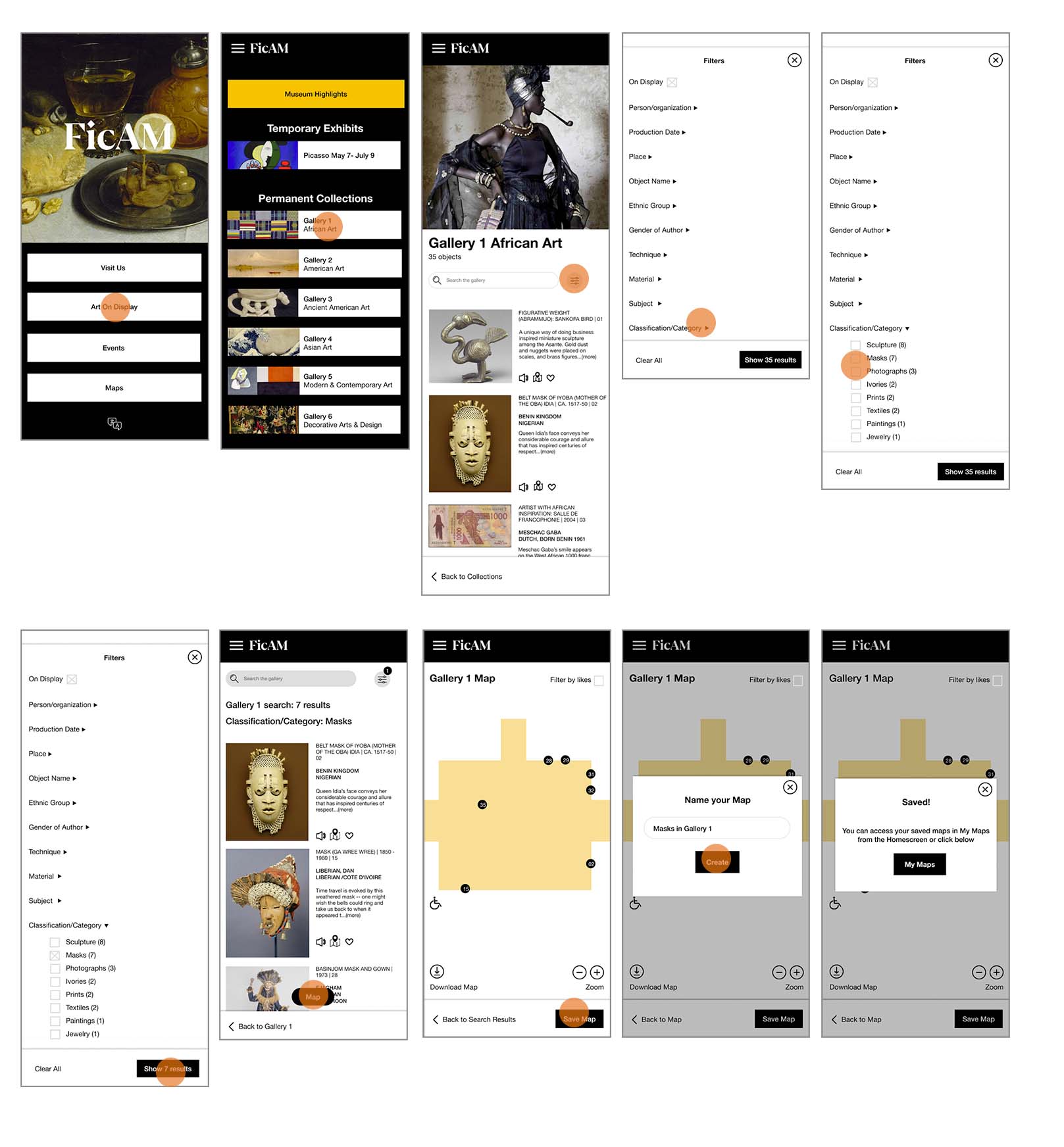
Prototype 2
Prototype 1 was tested with 4 participants. Participants were able to complete the task but found the labels confusing. They expected to see 'Galleries' vs 'Art on Display'. They also had a hard time understand how to classify 'Masks'. I updated the labels on the homescreen and simplified the categories in the Filter screen. Prototype 2 is the result of this feedback.
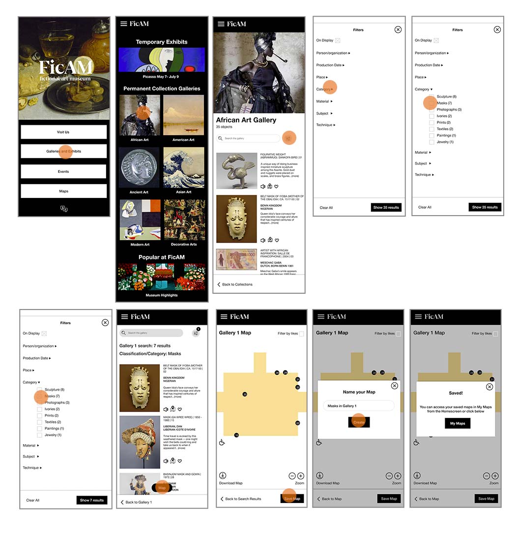
Prototype 3
Though participants were able to complete the task, they still had trouble using the filter page. Having too many options was confusing, Prototype 3 simplified the options and the input type.

Prototype 3 Video
More selected projects


delong.madison[at]gmail.com